Ceramic Surfaces
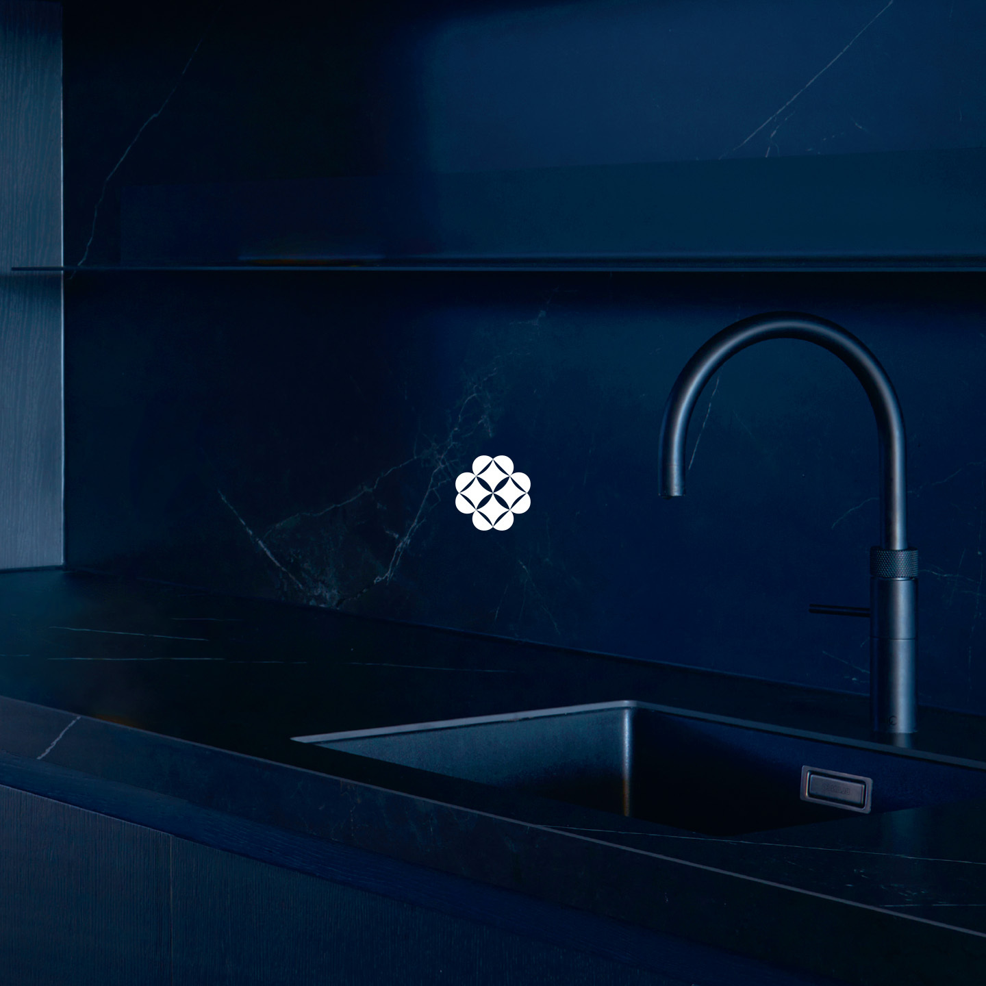
For the rebrand of Kölking Wobbe, who are a traditional family ceramic business based in the Ruhr region, we started by creating a new brand identity that aligns to the companies’ values.
Keeping the loved elements of their previous brand, we updated the logo, colour pallet and typography. From here, we extended the brand design to cover all visual aspects of the company.

The Kölking Wobbe website was also overhauled to include the new brand identity and a much-simplified UI / UX. To conclude we completed a smooth transformation from an older traditionally corporate brand to a modern, natural, and bespoke brand that is fitting for the tailored solutions that Kölking Wobbe provide.

Specialising in bespoke large-scale ceramics that are used in homes and commercial spaces, the visual identity further came to life through our production of their 80-page magazine, which focuses on their ceramic materials, from creation to installation.


